Dashboard UI Design Services
Simplifying complexity. We design intuitive admin and SaaS dashboards that turn overwhelming data into actionable business insights.
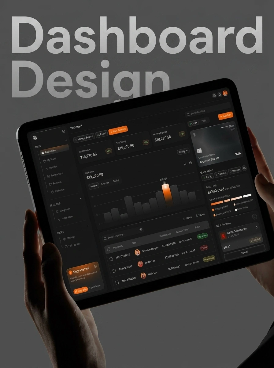
Professional Dashboard UI Design Services
A poorly designed dashboard is a liability. If your users can't find the data they need, your software will be ignored. Outgle provides dashboard UI design services that focus on managing cognitive load. We specialize in SaaS dashboard UI design that makes complex workflows feel effortless.
We prioritize data clarity over decorative fluff. Our admin dashboard design approach ensures that critical metrics are highlighted and secondary information is easily accessible. We solve the "where am I?" problem in large-scale software systems through intuitive navigation and clear visual hierarchy.
Our team in Karachi builds robust design systems specifically for data-heavy applications. We ensure that your dashboard remains performant and visually consistent as you add more charts, tables, and permissions.
Benefits of Strategic Dashboard Design
Six reasons SaaS companies trust Outgle for their interface needs.
Reduced Cognitive Load
We simplify complex information, allowing users to make faster and more accurate decisions.
SaaS-First Architecture
Designed for multi-tenancy, complex permissions, and data-heavy workflows from day one.
Intuitive Data Hierarchy
We ensure the most important metrics are always the most visible, guiding user attention strategically.
Unified Design System
A consistent set of components that makes scaling your software easy and visually coherent.
Increased User Adoption
People enjoy using software that is easy to understand. Good design drives product-led growth.
Efficient Workflows
We minimize clicks and reduce friction in your core user tasks, increasing overall productivity.
Ready to stop settling for average design? Get a free consultation
Our Dashboard Design Process
User Workflow Audit
We map out every task your user needs to perform to understand the necessary features and data.
Information Architecture
We organize complex data into a logical structure that makes sense to the end user.
Wireframing & Data Mapping
We define where every chart, table, and filter lives before adding visual styling.
UI System Building
We develop the high-fidelity visual language, including data visualization standards.
Dashboard Refinement
We build out the final screens, focusing on clarity, spacing, and interactive elements.
Handoff & Documentation
We deliver Figma files with full component documentation for your development team.
Why Outgle for Dashboards?
Five reasons software companies trust us with their core product.
Cognitive Load Management
We simplify complex data into intuitive, actionable insights. No more cluttered screens�just the data your users need to succeed.
SaaS-First Architecture
Designed for multi-tenancy, complex permissions, and data-heavy workflows. We build for the realities of modern software.
User-Centric Navigation
We solve the "where am I?" problem in complex systems. Intuitive navigation patterns that keep your users focused and productive.
Direct Specialist Access
Speak directly to the product designers in Karachi who live and breathe dashboards. Senior expertise, zero middle-men.
Start for Just 30%
Build your SaaS foundation with minimal upfront risk through our Grow Now, Pay Later program.
More Ways We Can Help


Common Dashboard Design Mistakes
Avoid these errors that make software unusable.
Too Much Data on One Screen
Overloading a user with charts and tables leads to analysis paralysis and a poor experience.
Inconsistent Data Visuals
Using different styles for similar charts confuses users and makes data harder to interpret.
Neglecting the Search/Filters
In a data-heavy system, a weak search or filter system makes finding specific information impossible.
Poor White Space Management
Cramped designs make a dashboard feel stressful. Space is a tool for clarity, not wasted room.
Ignoring the Developer Context
Designing complex UI that is impossible to build within your technical constraints is a waste of time.
Is your dashboard confusing?
Let's turn your complex data into a competitive advantage with intuitive design.
Get a Free QuoteMaster Your Data Experience
Do not let poor design hold back your SaaS product. Let us build a dashboard that your users will love and rely on.
Tight on budget? Ask about our Grow Now, Pay Later program. Start with just 30% upfront.
Dashboard Design FAQ
Our dashboard UI design services focus on 'Progressive Disclosure'�presenting the most critical information first and allowing users to dive deeper as needed. We use clear visual hierarchies, intuitive filtering, and consistent design patterns to ensure that even the most data-heavy interfaces feel organized and manageable. This leads to faster decision-making and a much better user experience.
Effective admin dashboard design requires a balance of speed and clarity. We prioritize high-frequency tasks, ensure that system-level status alerts are immediately visible, and provide robust search and filtering capabilities. We also focus on 'Role-Based Access Control' (RBAC) views, ensuring that different types of administrators only see the data and controls relevant to their specific tasks.
Yes. Every data dashboard design project includes bespoke chart and graph components tailored to your specific metrics. We don't just use standard libraries; we design custom visualizations that represent your data accurately and beautifully. This includes everything from interactive time-series graphs to complex heatmaps and geographic data visualizations.
For SaaS products, the dashboard is often where users spend the most time. A specialized SaaS dashboard UI design ensures that users can quickly find the value your product provides. If a dashboard is confusing or slow, users will quickly disengage. We focus on creating a 'stickiness' through intuitive navigation and high-value data summaries that keep users coming back every day.
We use a combination of 'White Space' and 'Information Chunking.' By grouping related metrics together and providing ample breathing room around each element, we reduce the visual noise. As part of our dashboard UI design services, we also implement collapsible sections and tabbed interfaces that allow users to focus on one specific area of the system at a time.
Absolutely. We provide high-fidelity interactive prototypes in Figma. This allows your stakeholders and actual users to 'click through' the dashboard, test the navigation flows, and provide feedback on the data presentation before any development begins. This significantly reduces the risk of expensive redesigns later in the project lifecycle.
A complete custom dashboard design project typically takes 4 to 6 weeks. This includes an initial week for requirement gathering and data mapping, 1-2 weeks for wireframing and flow optimization, and 2-3 weeks for high-fidelity UI design and prototyping. We maintain regular check-ins to ensure that the final design perfectly aligns with your technical constraints and user needs.
Transparent
Dashboard Design Pricing
SaaS MVP Design
Core application flow
- Up to 15 core application screens
- Basic component library
- Interactive Figma prototype
- Light or Dark mode
- 2 revision rounds
From $2000
Enterprise System
Full-scale scalable UI
- Comprehensive Design System
- Unlimited screen variations
- Complex data visualization UI
- Light & Dark mode tokens
- Full developer documentation